こんにちは。
先日作ったファイルをレスポンシブするためのメディアクエリーの指定方法です。
レスポンシブWebサイトを完成させる為の鍵は
小さな環境で動きを確認しながらコーディングすることです。
構成要素
今回は、文章と画像だけの最小限のWEBページにて試しています。
下図の通りです
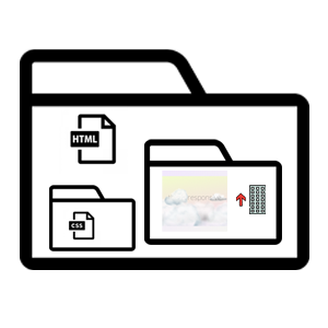
index.html / cssフォルダにstyle.css / imgフォルダにbg と response (2画像)
HTML ソース公開中
ヘッダータグにビューポートをスマホサイズにする為の宣言を記述する
<meta name=”viewport” content=”width=device-width, initial-scale=1.0″>
CSSソースでそれぞれの3サイズ一つずつ指定
(※ span style font-size: 14pt は不要ですが、プラグインツール利用のため削除が不可です)
@media (min-width: 570px) { body { background: skyblue; } .features p { width:45%; } .features img { width: 50%; } .features .item { margin-bottom : 60px; } .features .item:last-child { margin-bottom : 0px; } .features .item { overflow: hidden; } .pull-right { float: right; padding-left: 5%; } .pull-left { float: left; padding-left: 5%; } .totop img { width: 10%; height: auto; text-align: right; margin-bottom : 20px; text-decoration: none; } footer { padding: 10px 10px 10px 10px; text-align: center; } }
/* スクリーン820px用のための記述 */
@media (min-width: 820px) { body { background: red; } .features p { width: 45%; } .features img { width: 50%; } .features .item { margin-bottom : 60px; } .features .item:last-child { margin-bottom : 0px; } .features .item { overflow: hidden; } .pull-right { float: right; padding-left: 10%; } .pull-left { float: left; padding-left: 10%; } .totop img { width: 10%; height: auto; } text-align: right; margin-bottom : 20px; } footer { padding: 10px 10px 10px 10px; text-align: center; } }
/*1024pxの為の記述*/ @media (min-width : 1024px) { body { font-size : 100%; font-family: 'arial'; background: skyblue !important; background-size: cover; background-position: 50% 0; } .features p { width: 45%; } .features img { width: 50%; } .features .item { margin-bottom : 60px; } .features .item:last-child { margin-bottom : 0px; } .features .item { overflow: hidden; } .pull-right { float: right; padding-left: 10%; } .pull-left { float: left; padding-left: 10%; } .totop img { width: 10%; text-align: right; margin-bottom : 20px; max-width: 100%; height: auto; } footer { padding: 10px 10px 10px 10px; text-align: center; } }
[themify_button nofollow=”no” link=”https://tipsandtips.xsrv.jp/Responsive/index.html#top”]デモページ[/themify_button]
Viewport resizer Responsive design bookmarklet